
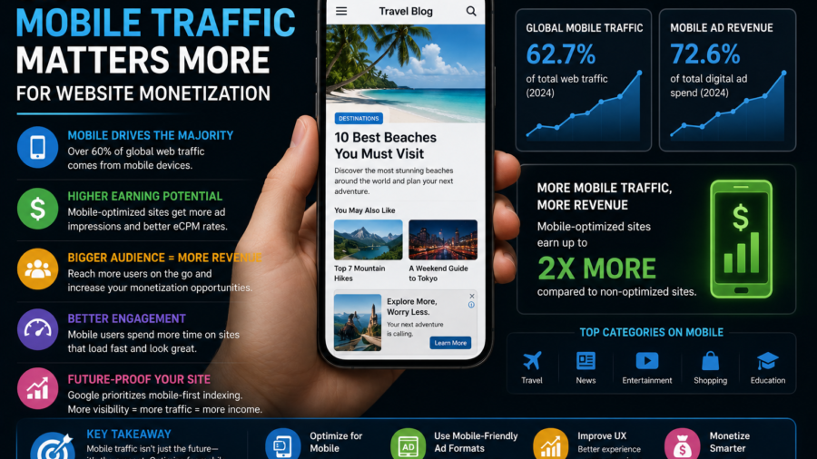
Mobile traffic can decide whether a website monetization strategy works or fails.
A publisher may design a clean desktop layout, place a few ads, check the homepage on a laptop and think everything looks fine. But most readers may not experience the site that way.
They may arrive on a phone.
They may come from Google Discover, search, social media, messaging apps or a news feed. They may be scrolling quickly. They may have a weak connection. They may be trying to read while commuting, traveling or multitasking.
That changes everything.
An ad placement that looks normal on desktop can feel intrusive on mobile. A banner that fits nicely in a sidebar may move into the article flow. A pop format that seems manageable on a large screen may feel aggressive on a phone.
For publishers, mobile traffic is not just a traffic source.
It is the main environment where ad revenue, user experience and reader trust meet.
Disclosure: This article contains a sponsored affiliate link. If you register through the link below, we may receive a commission at no extra cost to you.
Start Monetizing With Adsterra
Mobile Readers Behave Differently
Mobile readers are often less patient than desktop readers.
They may not be sitting down for a long browsing session. They may be looking for a quick answer, checking a trending topic or tapping an article from a feed. If the page is slow, crowded or hard to read, they can leave within seconds.
This matters for monetization.
Ad revenue is not only about showing ads. It is about keeping readers on the page long enough for ads to load, be seen and perform properly. If the mobile experience pushes people away, more ad placements may not help.
A clean mobile page can support stronger engagement.
A messy mobile page can waste good traffic.
The First Screen Is Critical
The first screen on mobile is small.
Readers should quickly see the headline, the beginning of the article and enough context to know they landed in the right place. If the first screen is filled with banners, pop-ups, overlays or empty loading space, the page feels low quality.
This is especially important for search and Discover traffic.
A user taps because they expect useful content. If the content is hidden behind ads, they may go back immediately.
A better approach is to let readers start reading before showing stronger ad pressure.
One ad after the opening section can be safer than forcing an ad before the article begins. The content should lead. Ads should follow.
Mobile Speed Affects Revenue
Slow mobile pages can hurt monetization.
Ads often add scripts, images, tracking calls or layout changes. If too many ad elements load at once, the page may feel heavy. Readers may see blank spaces, jumping text or delayed content.
This can reduce trust.
A publisher should test important pages on a real phone, not only inside a desktop browser. Open the article using mobile data if possible. Scroll like a normal reader. Watch whether ads load smoothly or make the page unstable.
If a placement slows the page too much, it may not be worth keeping.
A faster page with fewer ads can sometimes earn more over time because users stay longer.
Mobile Ad Placement Needs More Care
Mobile ad placement is harder because space is limited.
A desktop page may have room for a sidebar, top banner and in-content units. On mobile, nearly everything becomes part of one vertical scroll. That means every ad competes directly with the article.
Good mobile ad placement should feel natural.
A placement after the introduction can work. A mid-article placement can work in longer content. A placement near the end can work for readers who finish the article.
But too many ads close together can make the page feel broken.
The reader should never feel like they are scrolling through ads with small pieces of content in between.
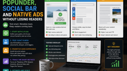
Native Ads Can Work Well on Mobile
Native ads can work well on mobile when they are placed responsibly.
They can fit between article sections or appear near related content. They may feel less disruptive than full-screen interruptions if clearly labeled and visually separated from editorial content.
The label matters.
Readers should know when something is an ad. Native ads should not pretend to be internal articles if they lead somewhere else. A clean label such as “Advertisement” or “Sponsored” helps protect trust.
Native ads should support the reading flow, not trick the reader.
For long-form articles, they are often one of the safer formats to test first.
Social Bar and Push-Style Formats Need Testing
Interactive ad formats may perform well for some mobile audiences, but they should be tested carefully.
A Social Bar or push-style placement may be visible and engaging, but it can also feel noisy if it appears too early, covers content or repeats too often.
The right question is not only “Does it earn?”
The better question is: “Does it earn without making readers leave?”
Test these formats on a small group of pages before using them across the whole site. Check mobile readability, scroll behavior and page speed. If the page feels too busy, reduce the intensity.
Mobile users have limited screen space. Respect that space.
Popunder and Interstitial Formats Are Higher Risk
Popunder and interstitial-style ads can generate attention, but they are more sensitive on mobile.
A popunder may feel unexpected. An interstitial can block the content if it appears too soon. These formats may work for some traffic types, but they can also damage user experience quickly if used aggressively.
If you test them, use limits.
Do not show strong interruptions immediately before readers see the article. Avoid repeating them too often. Do not use them on every page view. Watch whether mobile users leave faster after the format is enabled.
A publisher should never treat aggressive formats as default.
They are tools to test carefully, not shortcuts to guaranteed revenue.
Mobile Traffic From Discover Needs a Clean Layout
Google Discover traffic is heavily mobile-oriented.
That means Discover-focused publishers need to think like mobile readers. The image, title, loading speed and first paragraphs all matter. If the article feels cluttered, the user may leave before the ads have any real value.
Discover traffic can arrive in spikes.
When that happens, publishers may be tempted to increase ad density quickly. But if the page becomes harder to read, the traffic spike may not turn into long-term value.
The best Discover monetization setup is usually clean, fast and easy to scroll.
Strong traffic should be treated as an opportunity to build trust, not only to show more ads.
Search Traffic Also Needs Mobile Clarity
Search users often want a direct answer.
If someone searches “how to check app permissions on Android” or “how to choose an all-inclusive resort,” they expect the page to answer quickly. On mobile, that answer should not be buried under several ad blocks.
A helpful search page should make the answer easy to find.
This does not mean the page cannot show ads. It means the ad layout should not interrupt the user before the answer begins.
For how-to guides, place ads around natural breaks. Let the user understand the steps before adding too much commercial pressure.
Useful content should remain the main reason the page exists.
Mobile Layout Should Avoid Accidental Clicks
Accidental clicks are bad for readers and bad for trust.
On mobile, fingers are larger than links. If ads sit too close to buttons, menus, pagination links or download controls, users may tap them by mistake.
This creates frustration.
Ads should have enough spacing around them. They should not imitate navigation buttons or system alerts. Native ads should be labeled clearly. Banners should not be placed where users expect site controls.
A clean layout protects both the reader and the publisher.
Long-term monetization should come from real ad engagement, not confusion.
Match Ad Density to Article Length
Short mobile articles cannot handle the same ad load as long guides.
A 400-word post with three ads may feel crowded. A 1,500-word guide can usually support more placements because there are more natural breaks.
Before adding ads, consider the article length.
For short updates, keep the layout light. For long tutorials, place ads between major sections. For pillar content, test a slightly richer setup, but only if the page remains easy to read.
Ad density should follow content depth.
The article should never feel like filler between ad blocks.
Track Mobile Metrics Separately
Desktop and mobile results should not be mixed blindly.
A placement may perform well on desktop but hurt mobile engagement. Another format may be strong on mobile but unnecessary on desktop. If you only look at total revenue, you may miss the real pattern.
Track mobile behavior separately when possible.
Watch mobile page views, engagement, bounce behavior, ad revenue, page speed and layout issues. Compare before and after each ad test.
If mobile users leave faster after a new format, the extra revenue may not be worth the damage.
Good monetization decisions need mobile-specific data.
Use Referral Links Transparently
If your article includes a referral link, be clear about it.
A short disclosure near the link helps readers understand that you may earn a commission. The link should also use proper attributes such as:
rel="sponsored nofollow noopener"
This is especially important in website monetization content because readers are often evaluating tools and platforms.
Transparency makes the recommendation more trustworthy.
A hidden affiliate relationship can make the whole page feel less honest.
A Simple Mobile Monetization Setup
A good beginner setup can be simple.
Start with one ad after the introduction. Add one mid-article placement only for longer content. Add one near the end if the article is long enough. Test Native or Banner formats first because they are easier to control.
Then watch the data.
If engagement remains healthy, test another placement. If the page feels crowded, reduce the ad load. If mobile speed drops, remove or move the heaviest format.
Only after you understand the baseline should you test more aggressive options such as Popunder or interstitial-style formats.
Slow testing is safer than sudden overloading.
What Publishers Should Avoid
Avoid designing only for desktop.
Avoid putting ads before readers see the article.
Avoid too many ads in short posts.
Avoid pop formats with no frequency control.
Avoid making ads look like navigation buttons.
Avoid slow scripts that delay the main content.
Avoid hiding affiliate disclosures.
Avoid judging success only by one day of revenue.
Mobile monetization works best when publishers think beyond quick earnings. The site should still be readable tomorrow, next month and next year.
Final Takeaway
Mobile traffic matters more for website monetization because most readers experience websites on small screens, with limited patience and limited space.
A good ad strategy must protect mobile speed, readability, layout stability and trust.
Ads can help a website earn revenue, but they should not block the content, slow the page or make readers feel tricked. Native and banner placements can be safer starting points. Social Bar, Popunder and interstitial formats should be tested carefully with clear limits.
If you want to test Adsterra as part of your mobile monetization strategy, you can start here:
Start Monetizing With Adsterra
The best mobile ad strategy is not the one that shows the most ads.
It is the one that earns revenue while keeping readers willing to stay, scroll and return.


Comments
You can write your views about this story. Comments may be moderated according to site settings.